


During today’s Maxis Monthly Livestream The Sims Team has announced that they’ll be giving The Sims 4’s brand a complete revamp!
Starting early next week you’ll be able to see The Sims 4 in a whole new way with a whole new plumbob, new box arts, new renders and a new color palette surrounding the game!
The Plumbob
The Plumbob now has a glossier look with more saturated colors and more shine. The new plumbob will be replacing the old one in all places except in-game where the plumbob in Live Mode will remain the same.

The Box Arts
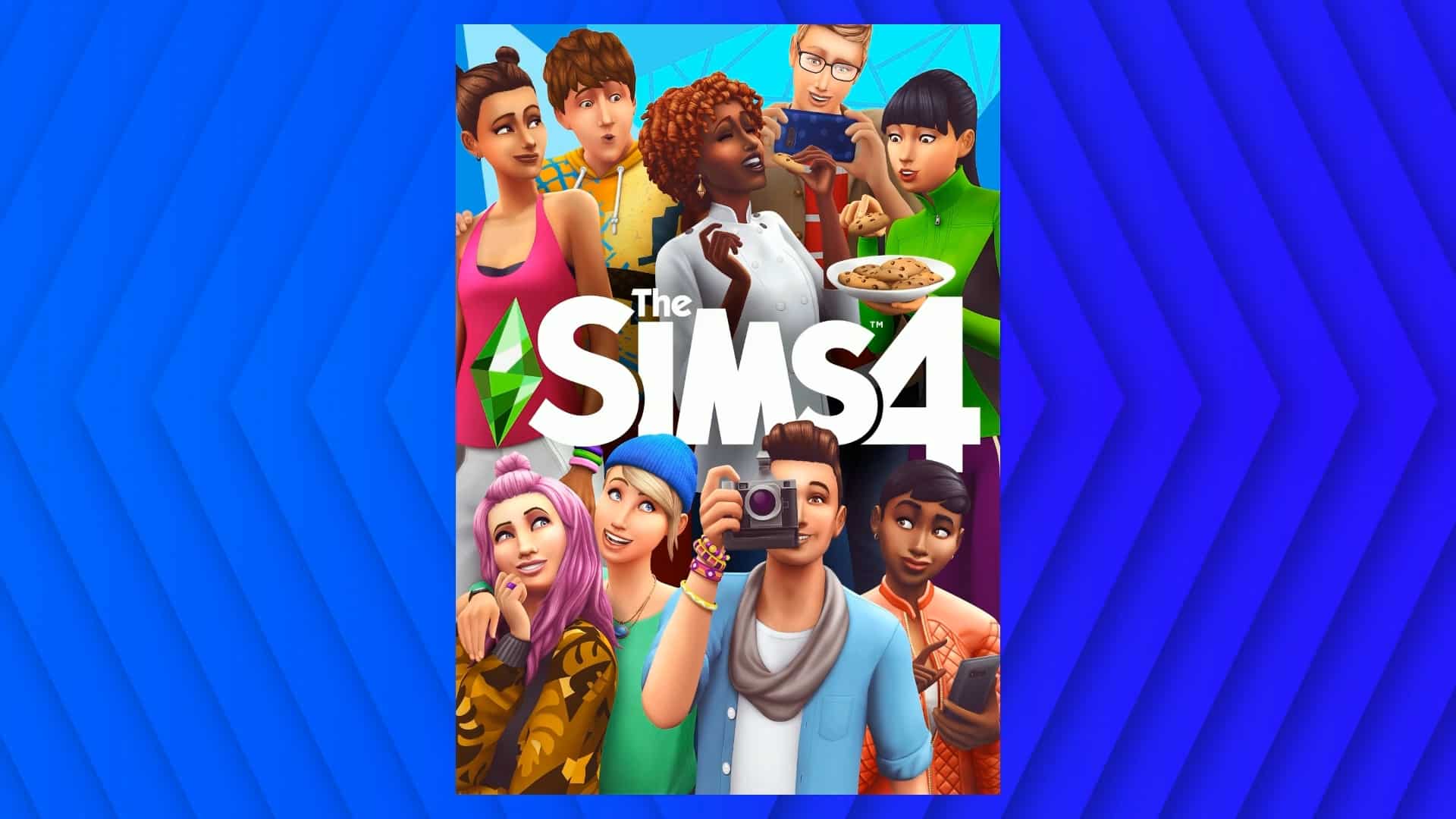
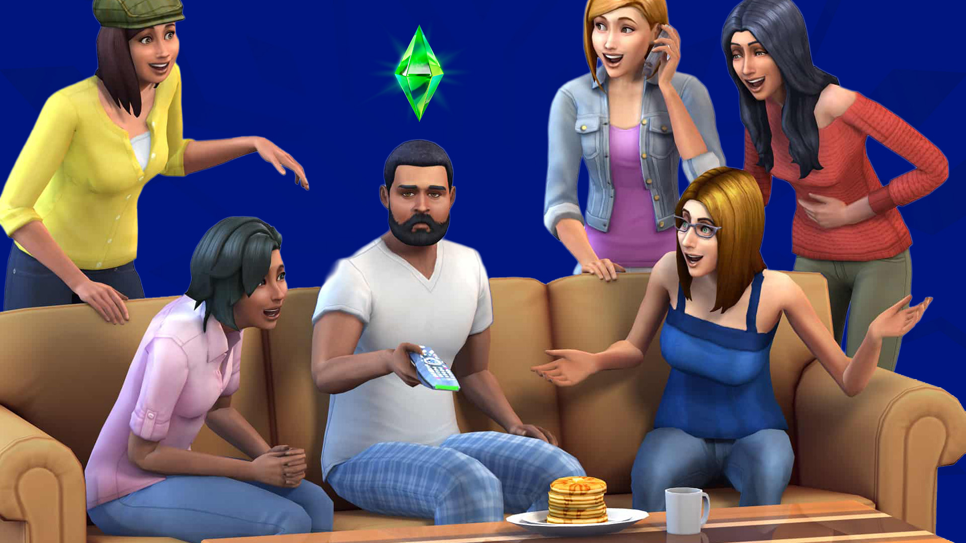
All of The Sims 4 box arts will be getting a whole new look, starting with The Sims 4 Base Game Box Art which features new Sims, a new plumbob and a new color palette!

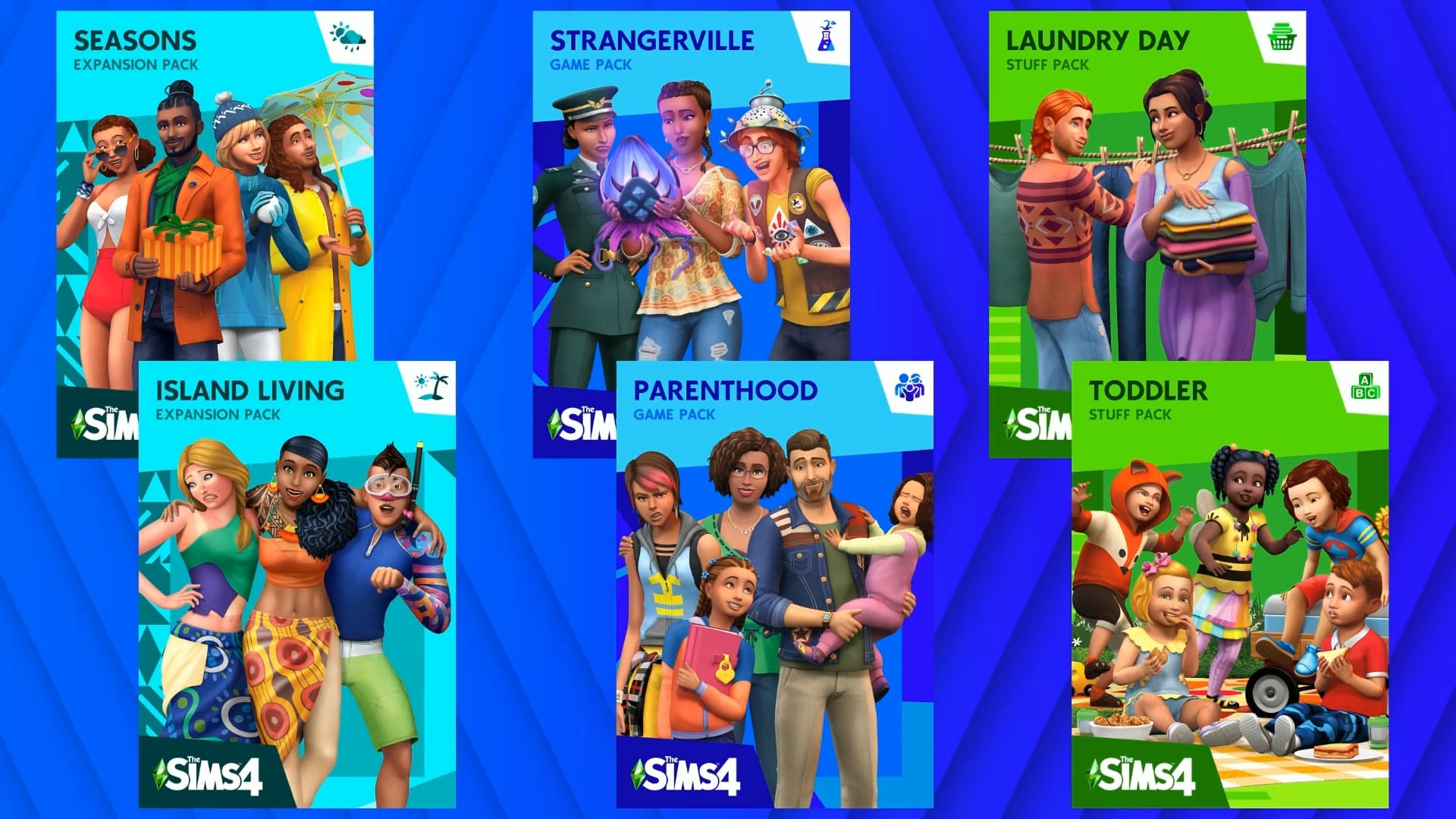
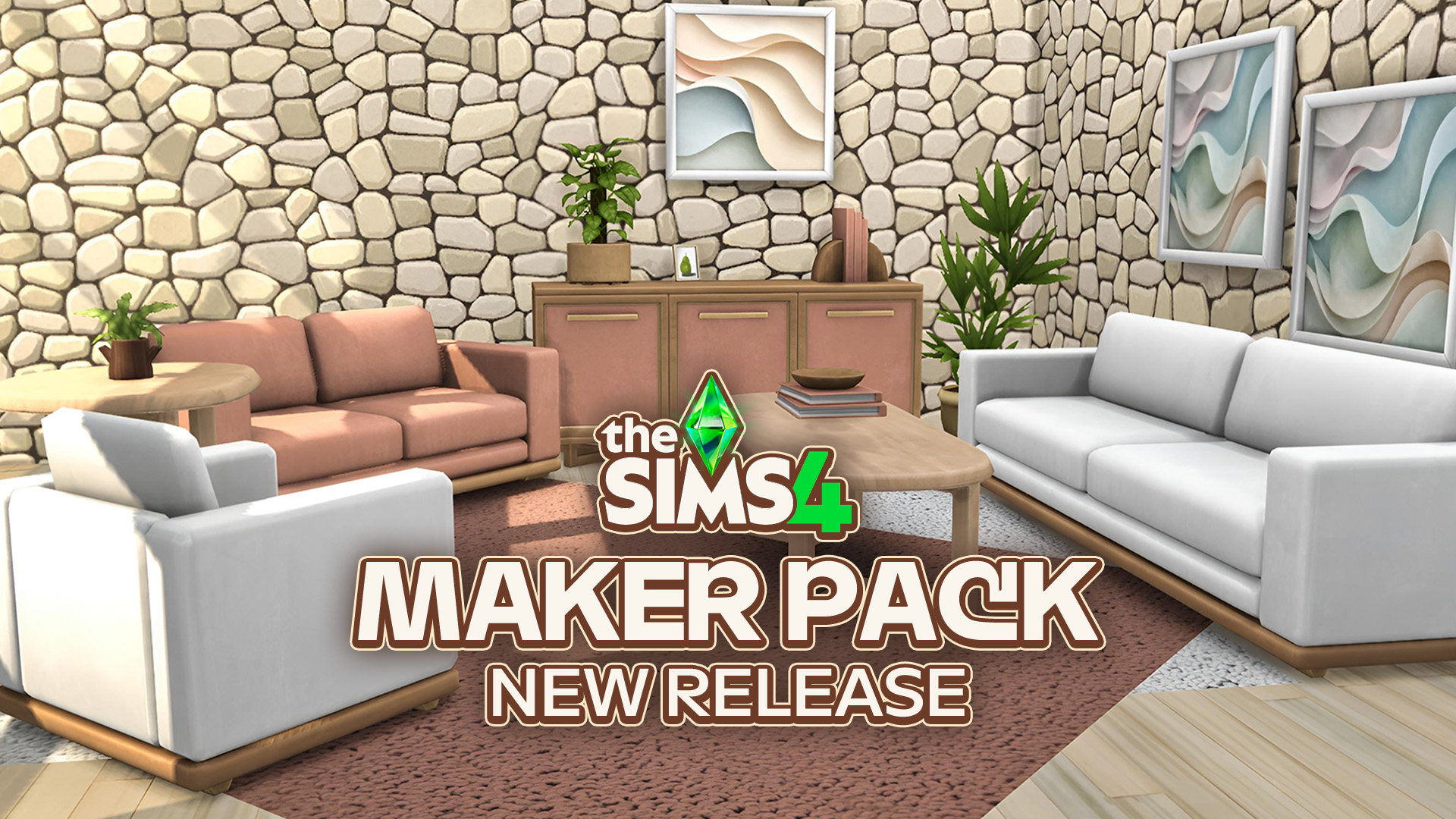
The Base Game isn’t the only Sims 4 game that’s getting a revamp – ALL of the current packs we have (and the future ones coming as well) will be getting a whole new look. Expansion Packs will no longer be marked to their specific colors (for example red for Cats & Dogs) but rather under the same color tone. All of the box arts will have their pack icon featured on the top right and will focus more on the renders now. Some of the box arts will even have an entirely different render featured – for example The Sims 4 Toddler Stuff Pack shown down below.
The Sims 4 logo will be featured in all of the pack box arts on the bottom left corner.
Main Menu
The Sims 4’s Main Menu now has a completely different look! There’s now a lot more room for Expansion Packs, Game Packs, Stuff Packs and Free Packs in the “Your Collection” section.
The Sims 4’s updated logo is now also added on the top right side of the screen. The Sims 4’s brand new signature render is displayed in the middle. Just like now you’ll be able to switch between different game renders!
Those who don’t have a complete collection of Sims 4 Packs will now also be able to build their own pack bundles using the “Build Your Bundle” feature straight from the Main Menu. This is exclusive to PC / Mac and won’t be transferred over to consoles while all of the other changes will be applied to Console players.

Loading Screen
The Loading Screen now features a new background and the new plumbob!

It seems The Sims Team still has plenty of more plans for The Sims 4. SimGuruFrost elaborated on Twitter why the sudden change of the look, saying that one of the main reasons why they’ve pulled this off was because of The Sims 4’s ongoing success. According to Frost, this is also a way to show The Sims Team’s commitment to support The Sims 4 for many more years.
The ongoing success of The Sims 4. We are in the fifth year of The Sims 4 and we think this is a great way to mark such an incredible milestone. It’s also a way to show our commitment to supporting The Sims 4 for many more years.
— SimGuruFrost ✈️ Sulani (@SimGuruFrost) July 12, 2019
240 Comments
What’s that extra free pack logo about?
Reply to crystal a willis
Idk which one you’re talking about but there’s three:
The free holiday stuff
The guitar you get for doing the newsletter
The family portrait of you sign up for Sims Mobile
Reply to Alex
I absolutely love it omg so awesome. Amazing. Well done. Now release more packs and expansions. Including university please and more worlds. Love love love is.
Reply to crystal a willis
The new update!
I hope they make the whole UI blue
Reply to Sava
The new box art is ok, the new plumbob and UI just don’t fit with the game. The Sims 4 has “soft”, colourful graphics that the old UI fitted the best. This rebranding fits the first The Sims game more than this one. It could have worked better if the blues were lighter, almost pastels.
What would be really nice is if we could opt out of the new UI in the settings! (similar to the interactive loading screen in TS3)
Reply to wenty
Wait, this was supposed to be a comment by its own. Blame it on the mobile interface!
What is the new free pack logo???
Reply to amani
it’s the family portrait
Yikes. I do not like the new look
Reply to Brooke
Saaaaame….
Reply to Brooke
It’s ugly. I really don’t like it 🙁 it won’t fit the rest of the boxes I have at home…. :(((((( why they’re doing it?? it’s ok to change some stuff here and there but not EVERYTHING!!
Reply to Brooke
Yeah I agree. It’s way too busy.
Reply to Brooke
The part I really hate is the pack rebranding. The only way I can tell the difference between my expansion packs is their color. Get Together is purple. City Living is blue. Now they’re all teal. Bad move Maxis.
Plumbob is great, loading screen is good, but whatever the f happened to main menu they better undo it NOW
Reply to Mikolaj Ejc
I don’t mind it. I mean sh*t i prefer the first one more. But i won’t lie i dislike the new Pack look and it technically makes part of the main menu so yeah… I agree change that
My god it looks horrendous! Such a step back.
That looks so much worse than before. Why would they do this?
OMG! However will we cope?
It’s okay but I like the original one more
Reply to Ava
Im not mad on the changes.. The bugs should be ironed out first..then focus on the other stuff such as new look (which is not necessary! I don’t like the new look sorry)
Reply to Herb405
You know that graphic designers have no part in fixing bugs right?
Reply to Ava
Do you know if we can still get the family portrait? The logo doesnt appear on my main screen.
Reply to Melidee
It’s not out yet. This is just the announcement of it. Says it won’t be ready for about a week.
LOVE THE MAIN MENU SCREEN!! So much better! I love the lack of WHITE! So many haters still pissed it’s not University.
Thank you for all THE FREE updates you provide.
If EA and the content creators spent as much time making the game great as they did doing stupid bullshit like this, there would no zero complaints from Sims fans.
I guess they ran out of colours to use for the expansion packs.
idk how i feel about this, this new look is okay i guess and i like the new base game box art, but the other box arts and the new main menu are kinda ugly.
So, console players won’t get the option to ‘build a bundle’?? That’s bs. The console expansions & packs are way overpriced.
Reply to HarlotSlaughter
i agree. us console players should get the same stuff!
I like it :)I like it a lot tbh
Reply to Zach
When will you be adding cars to Sims 4
I think this will make The Sims 4 a bit more worse… I really don’t like for example that every pack looks same and the Plumbob sooner looked better…
Soooo just new wrapping, no real substantial changes?? Well at least newcomers will have a neat new box…..
Major step back
You don’t rebrand because of success. You do a massive rebranding when you’re falling behind and need to grab attention again.
But also, seriously, you don’t celebrate success by creating the least user-friendly main menu experience to date. Half the screen is taken up showing you what packs you have or don’t have, the build-a-bundle advertisement is larger than the Play button, there’s videos to show off packs, and even social media icons, which makes this feel like a poorly designed advertising home page for a game’s website than a game’s main menu screen. Especially compounded by the fact they removed two of the buttons related to gameplay and you have to click on the smallest element on the screen in order to open up the menu. On the main menu screen.
That’s such an astounding level of UI design incompetence that it’d be given a poor grade even in a junior level design course, and professional companies would reject the work of whatever intern designed this and tell them to try again and remember they’re not designing an advertisement but rather a game’s main menu screen.
Reply to Erik
But they WERE designing an advertisement. The goal is to get you to constantly see which content you don’t have and provide easy ways for you to buy it and spend money. This was created to sell more packs to people.
Reply to Erik
I totally agree
Reply to Erik
It’s pretty obvious that it is supposed to be an advertisement first. Remember that EA makes money only when players buy packs. They don’t advertise in game, and you can’t \ don’t have to buy things to speed game play, or level up, ect.
Reply to A
I agree, but it would be nice if they touched upon the fact that your characters can – do and – will interact w/o the player moving them. I wish I had known this long ago… I play mmorpgs and this is the one thing that got me involved in the game (after I tried it out for the first time). Really was a game changer.
I think it’s different, i actually dont mind changing the game a little bit specially after 5 years! Even if it’s small things like this
wow that looks bad
You could always do build a bundle, in Origin, that’s not new whatsoever.
Are there going to be any new hair styles??
I don’t like it.
This looks awful… It was much better before. This is the kind of branding I feared when I heard the mobile devs were coming to TS4
Reply to Ares
They ruined a good UI
Ugh I hate the new plumbob 🙁
Is Xbox getting CC?!
Reply to TaNiha
No I don’t think
Reply to TaNiha
I wish tho
I loved the different colors of the expansion packs because it would be the main way that I use to find which expansion pack I’d wanna choose to use the items of in cas, buy mode or build mode. It was just easier that way. Plus it was sooo exciting wondering what color the next one would be! Maybe y’all ran out of colors and that’s why but still. You can’t fix something that isn’t broken.
Are you guys gonna fix the start up loading time yet?
It was fine for me when I first bought it but it’s gotten longer and longer ever since this year started.
Plus an even bigger question is why have cars that they can’t use? I promise you with every unnecessary change I start to not wanna play it and lean more towards playing sims 3 instead…:(
Where are the “Load Game” and “New Game” options on the home screen? Is there a second option screen once the Play icon is clicked? Seems an odd choice to leave those buttons off the new menu design…
Maybe the sims team should focus more on…idk the bugs and the disappointing lack of content their packs still continue to give us.
Reply to Kenna
That’s exactly what I was thinking. Like… the toddler bug would be a nice one to start with, imo.
Hmmm, I’m of a mixed opinion on this… On one hand, the logo looks sweet and the pack icons make sense. On the other hand, I’m not sure I like the renders of the main menu animations…
Thanks! I hate it!
I like the color scheme and the new plumbob. But I want my main menu and load screen to stay the same
When will the sims ever get a modern graphics overhaul? It’s one of the most expensive games I have yet the graphics are stuck in the past. Even sports games have it beat by a long shot. I’d love to see something like gta or red dead graphics. Even Detroit become human looks great. It’s my biggest problem with the game.
Reply to Cody Flynt
Imo, with the stuff you can do to/with Sims it wouldn’t suit realistic graphics.
Reply to Alissa
you probably never played sims 3 before
The rebranding screams “graphic design is my passion”
I was wondering if they were going to change up the color system for expansion packs since I noticed they were slowing running out of color options! I’m not sure how I feel about the use of so much blue in the menu and loading screen though, it’s a lot less sleek than the all-white background and the intense vibrancy hurts my eyes a little.
Pls EA dont change the old UI and layout design of SIm4. I prefer the modern and eye-friendly color scheme. The New LoGo and RGB BLUE is so horrible . and it look like a kid game!!!!!!!!!!!!!!!!!!!!!!
I’m fine with the plumbob and the new base game box art, but the expansion/game/stuff packs look hideous
I’m sorry, but I’m Maxis Monthly, they said they were getting a lot of players and the Sims 4 was a big deal right now. So why change it? Maxis, you are going to lose money because of this decision. No one wanted this. No one asked for this. Hardly anyone likes it. Can you please change it back to the way that everyone knows and loves?
EA should work on making good and exciting content for this lacklustre game instead of waste time and money on something that ultimately doesn’t matter. I think the Sims 4 is still totally lacking as a Sims game and it’s been out for 5 years. It shows this company doesn’t care about you.
Reply to Matt Raffaele
YES.
Noooo, change it all back. The loading screen looks horrible.
I was hoping for a cas upgrade. The create a pet is so gooood! Why can I have ombre dogs but not ombre hair? D:
Wait I don’t have to re buy my game do I ? I just got it last week!!
Reply to No
That’s good, and if you saved the receipt you still have a chance to save yourself from the over priced bugs, stress, headaches and eye strain that are included with the game. 🙂 (mostly being sarcastic here)
Nope, don’t like the new look at all.
I might have missed it but does this update include for all of us console players? EA and Maxis has come a long way with sims! So happy be a Simstar!
what’s going to happen to all my custom content?
Its not fair that pc is getting way cooler and more stuff then on console but i guess it’s hard to do both.
This shit looks horrible nothing is wrong with the current game like it looks like we’re playing in the 1980’s
of course of COURSE the build a bundle feature is only avalible on pc/mac of COURSE
I wish the rebranding parts were free packs, so you had the choice whether or not to download it. I’m personally not a fan of it and I’m not sure if I want to update this into my game.
I miss the days where you could go in and customize anyting in the color that you want it in the game I miss being able to remake an outfit the way I wanted it.
Well dang. Here I was hoping for the extensive color/pattern create a sim and build mode options. I miss making everything match.
I like the original so much more.
ew. i want sims 5 rn
Please add mods and cc on sims ps4
Could you add magic into the game like witches who can do magic? Or an expansion pack with witches?
Try optimizing the game’s performance first before you do these pointless changes.
I wish we can get 2 player mode back on console
Ugh my eyes. I hate it, it’s oversatured and the contrast is excesive. I hope they give us the option to keep the old look or that modders find a way to revert it…
Thanks i hate it
i think it looks very nice although i hope the bugs got fixed
I’m okay with most of this but I really liked having the packs be different colours so it looks much more plain.
And just the main menu in general…. how about no thanks, the whole ‘build your bundle’ advertising/getting you to buy stuff is really in your face aside from anything else
I really love the new plumbob! But this new image is kind of Sims Mobile
The simplistic look literally every company is redesigning their look to is so ugly. The Sims branding and look was fine before. No one was complaining about it. If it ain’t broke, don’t fix it.
Reply to J
right?? there’s no need to redesign something that was already good
I feel as console players don’t get a lot of what PC players get. For example; PC players like me, get CC, Xbox and PS4 players don’t. PC sometimes get updates console players don’t like the freelancing job. I just don’t think it’s unfair for them.
wow it’s so.. blue.. I dunno if I like it, plus it’s going to be difficult getting used to everything being in a different place
Reply to Chloe
Ok, I’ve been looking at it for the past few minutes, and I do not like it. It’s oversaturated and the contrast is crazy (which is an accessibility issue). The blue is harsh, and it’s all over the new look. The new plumbob is.. overly simplistic, looks like something a free mobile app would have tbh. Honestly, the whole thing is overly simplistic. The play buttons, etc got switched around, the expansion packs are all the same color now.
This should be an opt-in new look, which could be toggled in options with a switch “old version” is off, “new version” is on.
I don’t understand why all these companies are rolling out unwanted, oversaturated/highly contrasted, overly simplistic redesigns with no “go back” button. It’s an accessibility issue and overall just unnecessary
I just miss open world 🙁
Welcome to Sims Community!
Our community is about connecting people through open and thoughtful conversations. We want our readers to share their views and exchange ideas in a safe space.
In order to do so, we've created a simple set of rules that will improve your experience. Simply put, keep it civil.
Your post will/might be rejected if it contains:
User accounts will/might be blocked if we notice:
So, how can you be a power user?
Thanks for reading our community guidelines. Please note that we're aware of certain issues with Sign In / Log In and Create Account / Email Confirmation issues. We're working behind-the-scenes on a new Account Creation process. Thank you for your patience and remember - freedom of speech is not freedom of reach