
The Sims 4's Main Menu went through A LOT of changes ever since the game's release in 2014. There have been plenty of reasons why the Main Menu changed through the game's lifespan - the releasement of new packs, new gallery features and showcases and in general the desire to make the menu organized and filled up.
In this post I'll be showing all the different versions of The Sims 4's Main Menu for all the User Interface fanatics and graphic designers out there!
2014-2015 Main Menu
The Sims 4's first Menu was simple. Maybe a bit too simple. It featured a lot of plain white with not much going on except the cool animated splash screen showcasing different features that came with The Sims 4 Base Game. The release of The Sims 4 Outdoor Retreat Game Pack also brought in some new video animations.
You can also check out some of the animations that were featured in the video below:
[embed class="is-loading"]https://www.youtube.com/watch?v=wnsd3Lpbye8[/embed]
2015-2017
The Sims 4's first Expansion Pack (Get to Work) also brought a new Main Menu. It featured an animated splash render of the latest installed pack as well as information boxes on the bottom of the screen that featured Community Highlights, Tips and more. There was also a My Packs category that featured box arts of all the Packs that there are and which ones you own. This design has been similarly implemented on the Main Menu we have today.


2017-2019
With more packs releasing came the need to fit them all together on the Main Menu. In February 2017 shortly after the release of The Sims 4 Vampires Game Pack came a new Main Menu with somewhat similar elements featured on the right side of the screen. On the left was a banner with save game options and a collection of all The Sims 4 Packs. However, as 2019 came the Pack Collection menu became too overpopulated where players then had to scroll to see the entire collection.
2019-2020
In July 2019 there was a huge rebranding of The Sims 4 which changed the look of some of the game's User Interface elements - including the Main Menu. Online news and information have been displayed on the top center with the latest packs and their trailers showcased on the left. The Your Collection category has been recategorized so that all the packs could fit in properly. However, the Stuff Packs bar kinda became too big with new releases, leading up to the Main Menu we have today.

2020
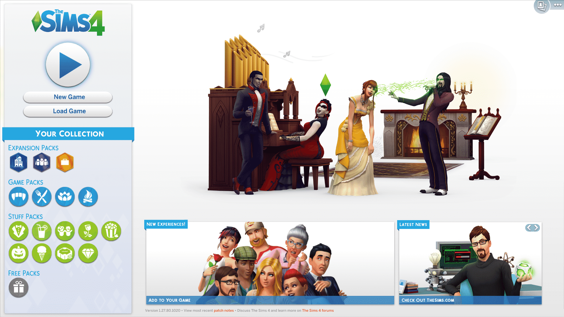
Probably the most drastic Main Menu change. Online news, pack releases, new challenges and gallery creations are now put up front and center with save game, gallery and game options displayed on the right bar. The Sims Team also reverted back to showcasing the packs as boxarts in the Packs category so that the Main Menu doesn't keep reminding you constantly of which packs you possibly don't have. The category features Pack type filters as well as filters for packs you have or don't have purchased. All the pack reminders regarding the Pack discounts and sales have also moved to this category!


2025
The Sims 4 Main Menu evolution continues almost 11 years after the release of the Base Game. This time releasing just in time for the 25th Anniversary Celebrations, the new Main Menu puts your last played household on the front center of the screen.
You can also expect background changes depending on The Sims 4's current Roadmap.


7 Comments
And watch as it tragically becomes more and more pack centric. It’s so shameless, I don’t have all the packs and I don’t want all the packs, but the new menu makes me feel like my game is incomplete (which my god it is, but not because of the Star Wars and knitting packs I refused to pay for)
Reply to Bungee Fox
literally the new main menu doesn’t even show you the packs unless you click to see them…
Reply to Bungee Fox
keep refusing! i bought star wars because i couldnt help it and i have all other packs – big big big big mistake holy crap its so bad. not even a sims game anymore, and ill never play it. waste of $ 🙁
Reply to Bungee Fox
Dude. What screen are u looking at lol. How in the woooorld does the new screen make u feel like? Are u sure u got the new screen? Im convinced u never seen it.
It looks a little unfinished, design-wise, imo. The buttons and tabs on the top left look like PowerPoint hyperlinks, they could’ve been blended in better using a similar style to the right side buttons, making them more like tabs, or with a different shade of blue. It’s also very disproportionate with the sizing, fonts and the spacing between elements overall. There’s no breathing room and ends up looking way too busy and almost overwhelming.
IT LOOKS LIKE A DAMN WEBPAGE
I love the new menu update. Now if they can match the Worlds hub to match the home screen that would be amazing. I got tired of the same boring style that was there for like 5 years and things need a refresh to stay fresh.
Welcome to Sims Community!
Our community is about connecting people through open and thoughtful conversations. We want our readers to share their views and exchange ideas in a safe space.
In order to do so, we've created a simple set of rules that will improve your experience. Simply put, keep it civil.
Your post will/might be rejected if it contains:
User accounts will/might be blocked if we notice:
So, how can you be a power user?
Thanks for reading our community guidelines. Please note that we're aware of certain issues with Sign In / Log In and Create Account / Email Confirmation issues. We're working behind-the-scenes on a new Account Creation process. Thank you for your patience and remember - freedom of speech is not freedom of reach