


Visual Designer shares Concept pieces for The Sims 4's latest Redesign!
The Sims 4 Main Menu got refurbished back in January 2025, and this weekend we've gotten more into what went into the development of this interface update.
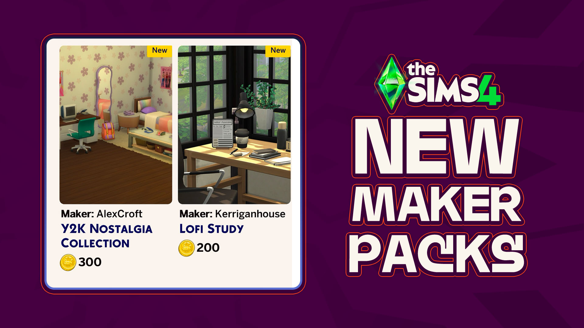
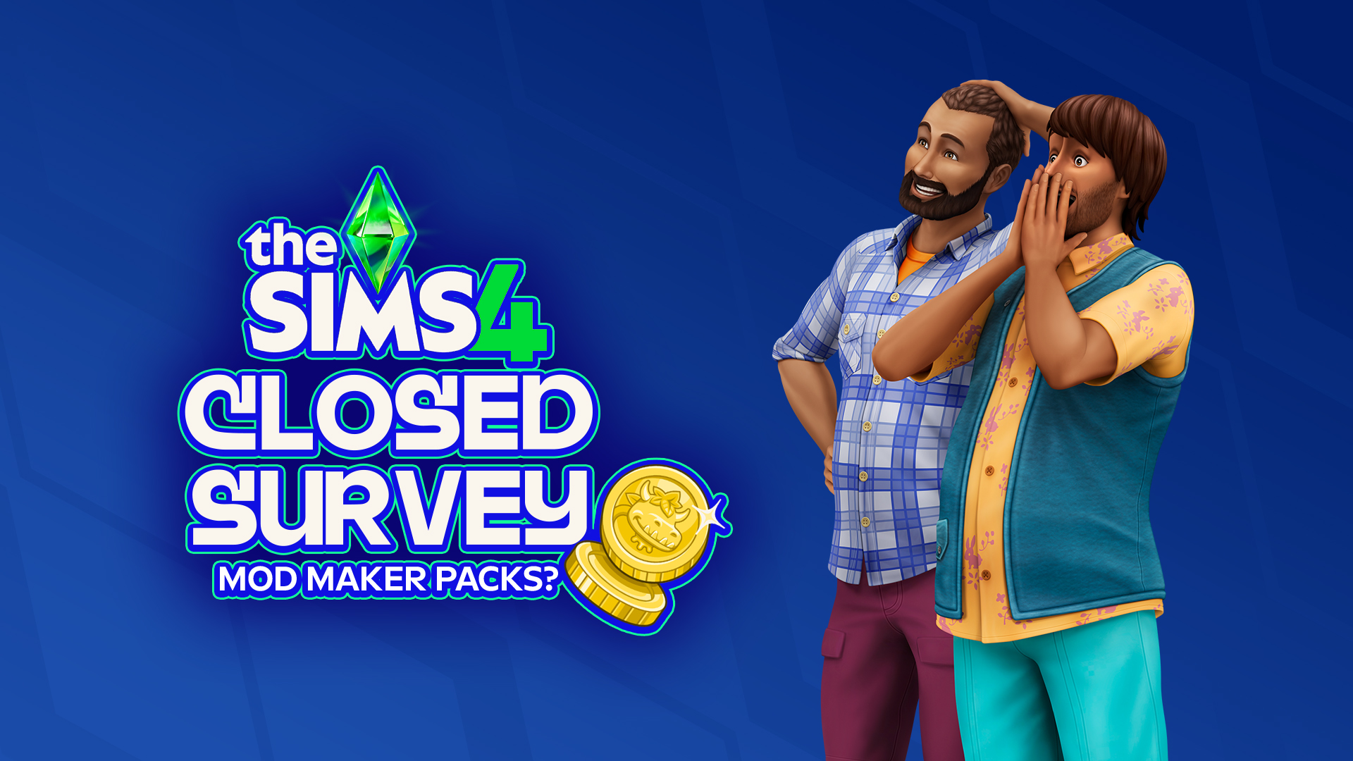
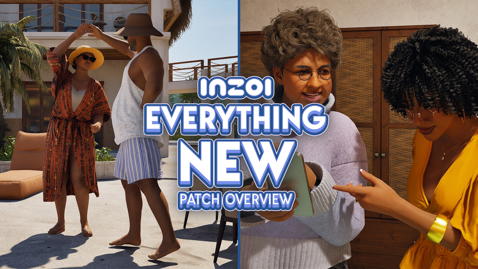
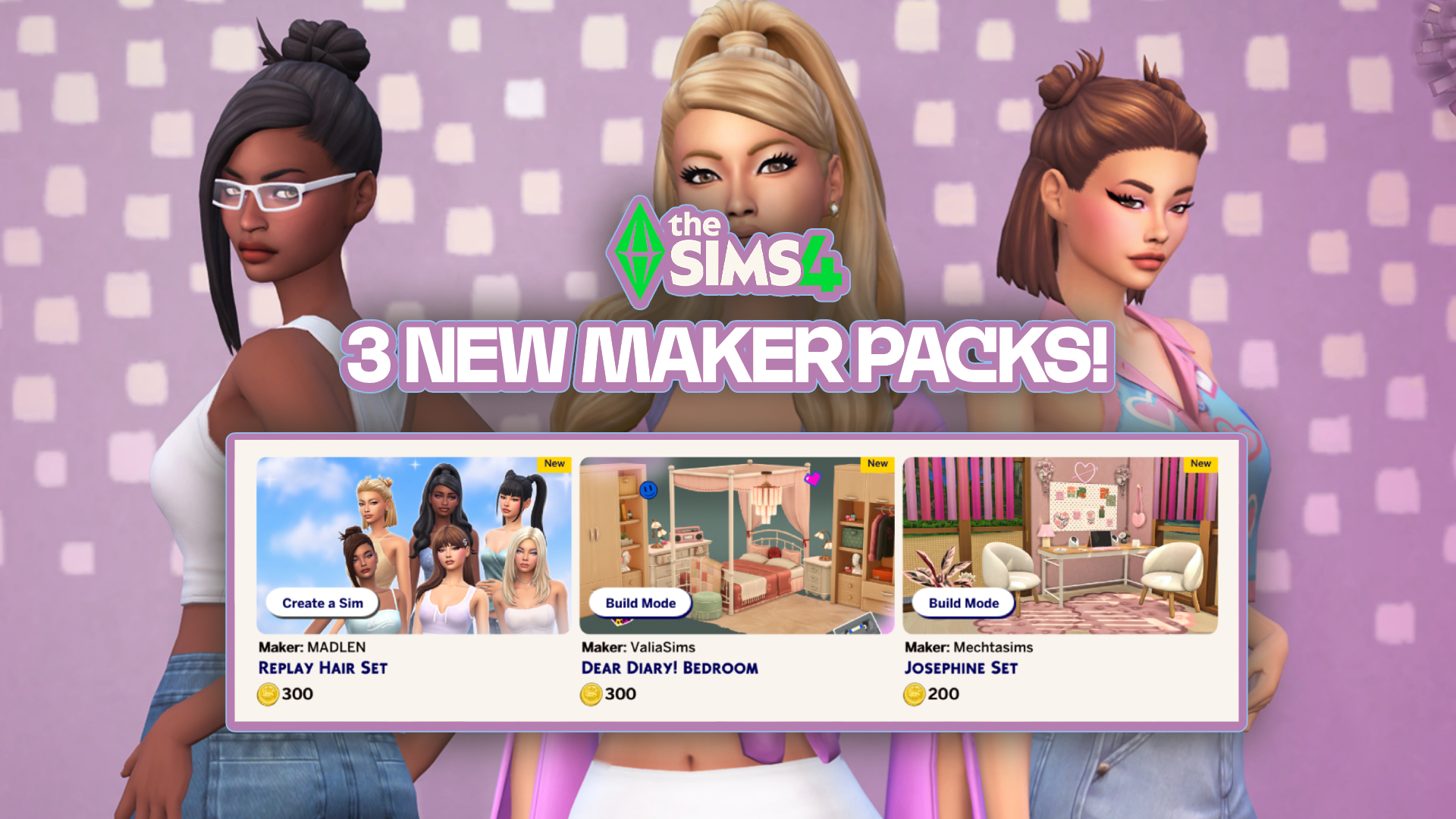
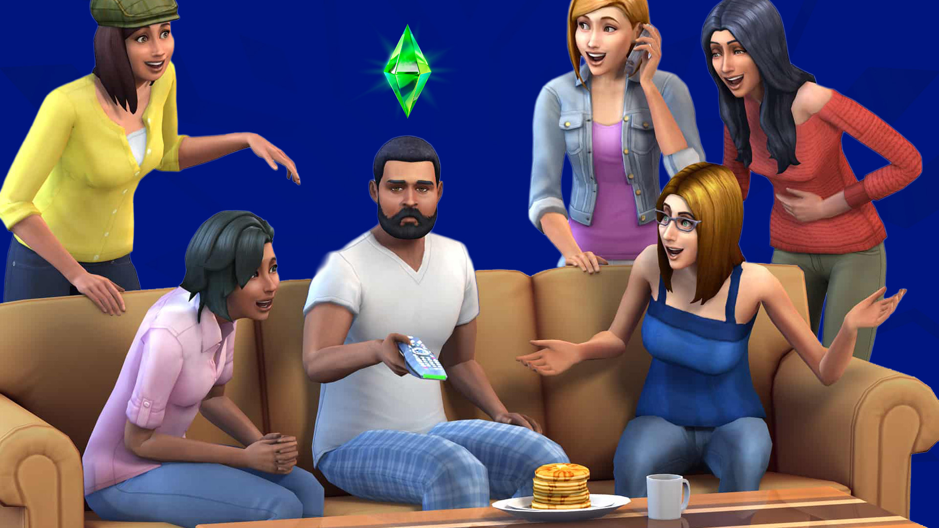
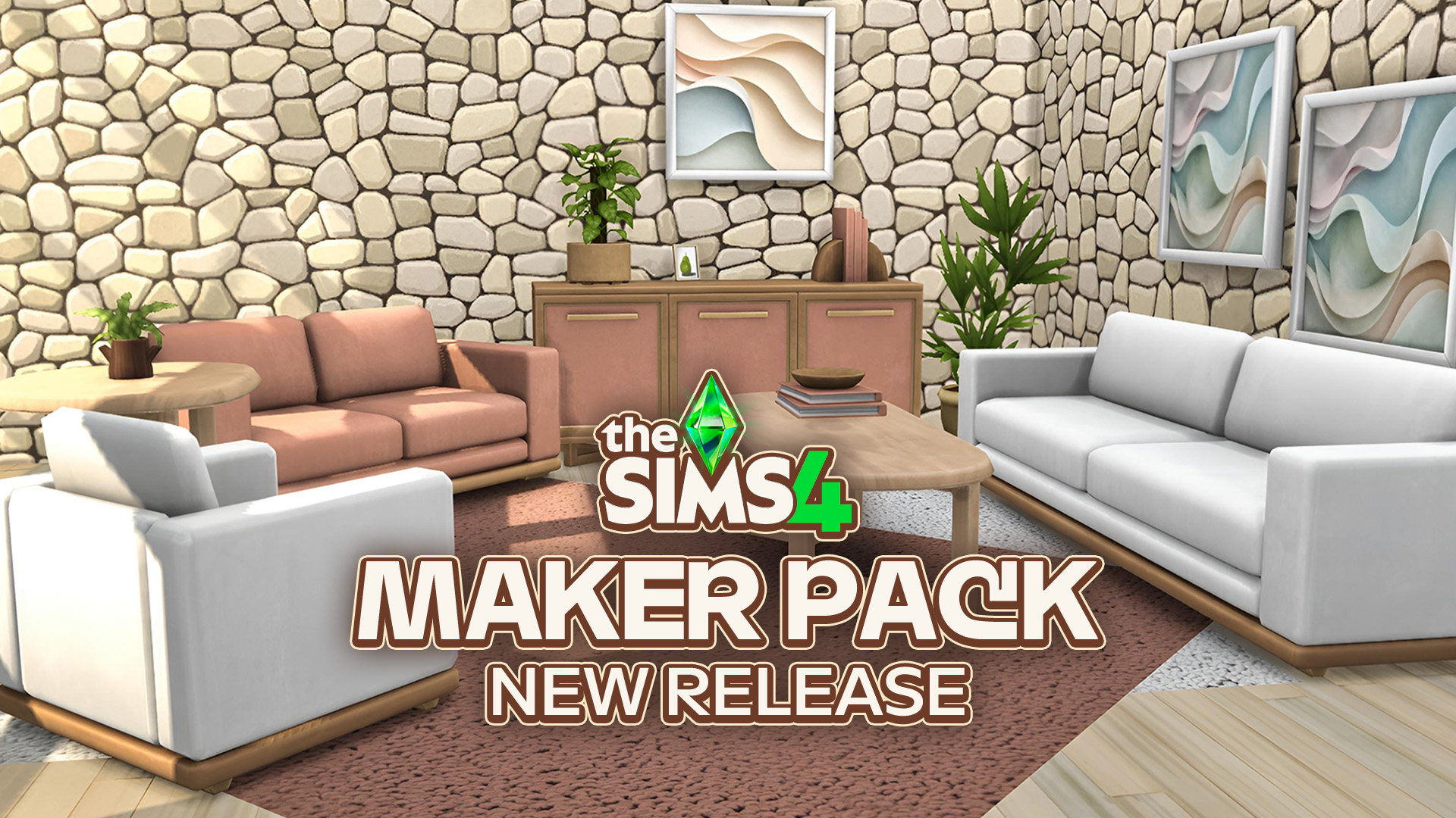
John Montenegro, who worked on The Sims 4 Main Menu redesign project shared interesting concept art pieces. Including exploration for The Sims 4 Main Menu UI, Splash Screens, Sims 4 Events and more. Even revealing some interesting character exploration with a Grinch-Like Sim.

Check out all the work for The Sims 4 Main Menu Redesign below:
The Sims 4 2025 Redesign Concept Art
The Sims 4 Main Menu Exploration


The Sims 4 Main Menu Ads Exploration


The Sims 4 Events UI Concept Exploration



Please note: Some of the elements that the concept artist used here have been pulled from Google and various Sims creators. Including fan-made custom Sims 4 World Icon created by Hazza Plumbob and the Rosie Sims 4 CC Sandals.


The Sims 4 Main Menu Concept Art piece that you see above contains quality versions of paintings that we have in the game. Such as the Cordelia's Palace Painting.

The Sims 4 Live Event Concept Screens


Miscellaneous


Please note that all images above, including Concept Art pieces within The Sims 4 Main Menu images are all explorative and do not contain any hints or clues for the future of Sims 4 DLC. Everything shared is purely illustrative of the road to the Main menu design we have in the game today.
What are your thoughts on these Concept Art pieces? Let us know in the comments!

3 Comments
I still miss the old screen. The new one is so load and aggressive. The blue screen from January just screamed tech oriented household. The 25th anniversary background looks like a graffiti wall, as if the sims team is pushing us to play grungy run down sims. I would like neutral backgrounds. But seeing the other designs, they all seem loud and aggressive. I hope the next redesign in a few years will be more peaceful.
It’s giving gift card aesthetic. These are like prints a gift card would have
I like the grinch character
Welcome to Sims Community!
Our community is about connecting people through open and thoughtful conversations. We want our readers to share their views and exchange ideas in a safe space.
In order to do so, we've created a simple set of rules that will improve your experience. Simply put, keep it civil.
Your post will/might be rejected if it contains:
User accounts will/might be blocked if we notice:
So, how can you be a power user?
Thanks for reading our community guidelines. Please note that we're aware of certain issues with Sign In / Log In and Create Account / Email Confirmation issues. We're working behind-the-scenes on a new Account Creation process. Thank you for your patience and remember - freedom of speech is not freedom of reach