The latest update for The Sims 4 that introduces Skin Tone and Makeup Sliders and options has also given a major revamp to the Main Menu of The Sims 4!
Check it out below:


The latest update for The Sims 4 that introduces Skin Tone and Makeup Sliders and options has also given a major revamp to the Main Menu of The Sims 4!
Check it out below:
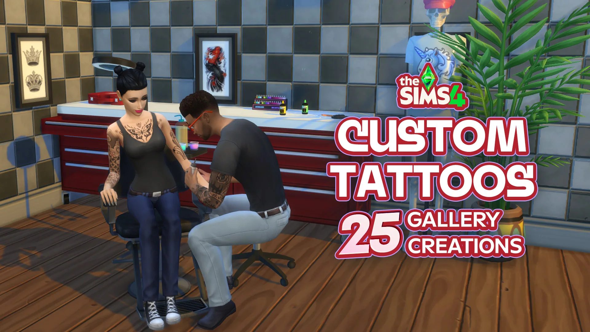
Wanting some fresh ink for your Sims but not wanting to hunt through hundreds of downloads or go through years of content on Patreon sites? In this list, I compiled some of The Sims 4 Galleries’ best tattoos that I could find, along with their creators and hashtags, if available, to make everything as easy…
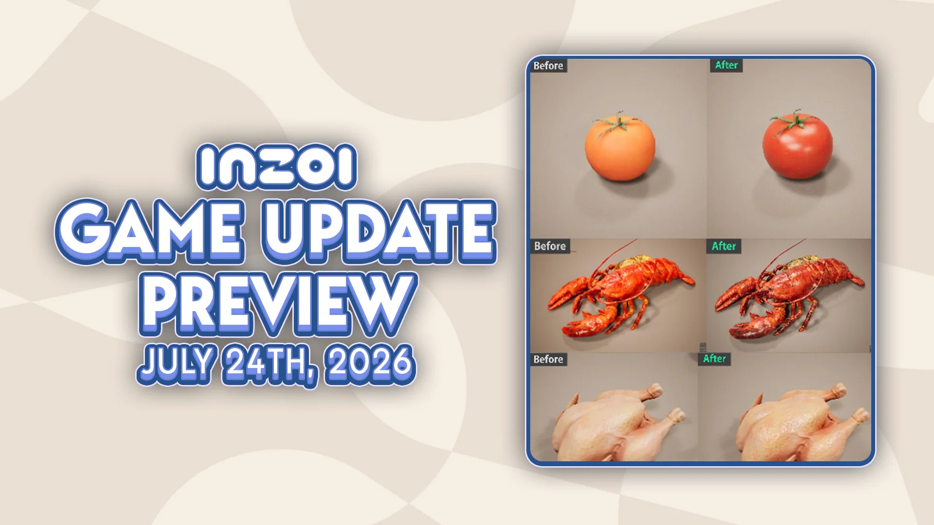
The next InZOI Update is sure to be a core one, with developers promising huge improvements to the simulation, autonomy, modding, controls, and so much more to come very soon in the InZOI August Update and beyond. A new developer diary hosted by Kjun was released on Social Media and the InZOI Official Discord, detailing…
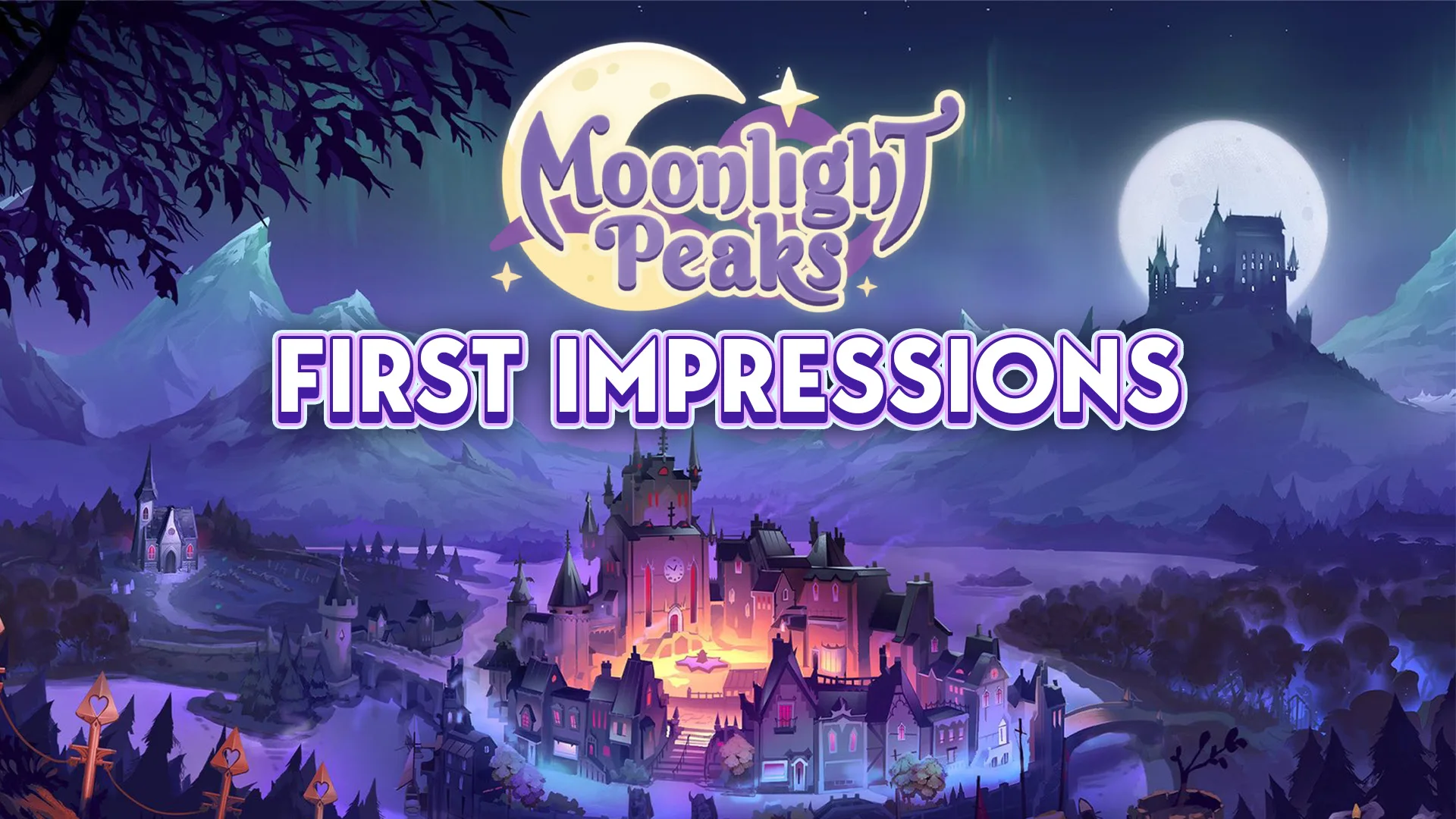
With cozy games, life sims, and farming sims being so popular for so long, it is always a real treat to see developers bringing a fresh theme to these genres, and that is what the creators of Moonlight Peaks have done. Moonlight Peaks is a new farming simulator that released July 6th, 2026, by Developers…
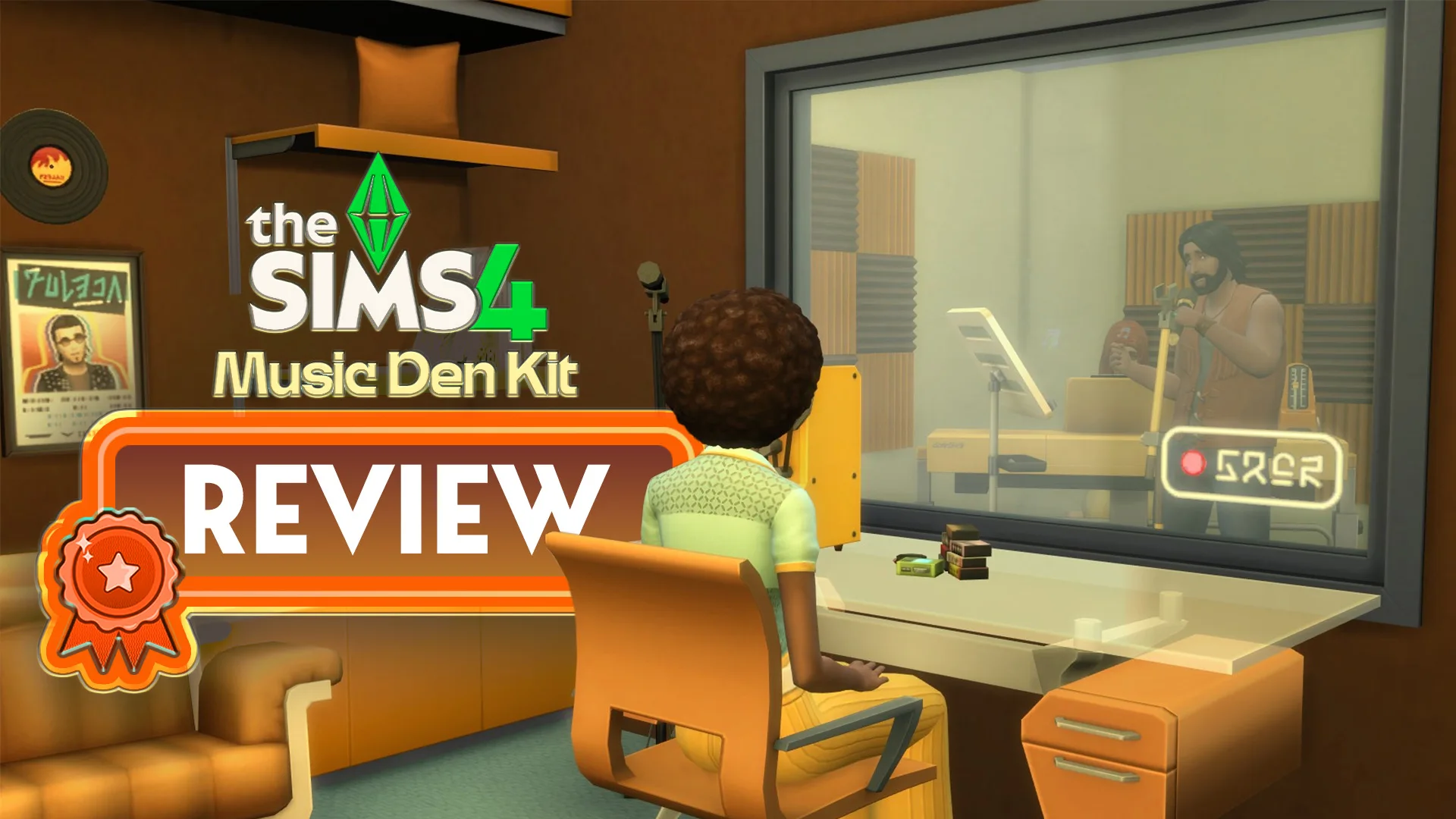
Rock Out Retro-Future Style – The Sims 4 Music Den Kit Is Here! A new Sims 4 Kit is here, and for the first time in a while it isn’t a brand collaboration or a Creator Kit. The latest offering comes directly from the Sims team, bringing with it new Buy Mode items for music…
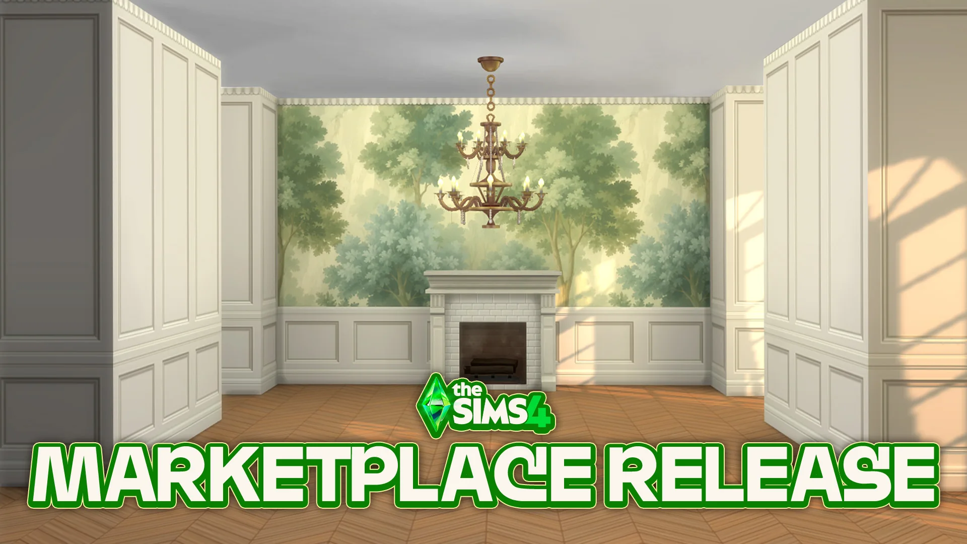
New The Sims 4 Maker Pack has been added to The Marketplace. The Sims 4 Marketplace has gotten a new Maker Pack release today priced at 200 Moola. The Haussmann Walls & Floors Maker Pack by Syboulette is the first ever dedicated Walls & Floors set for the Marketplace, bringing new original patterns for your…
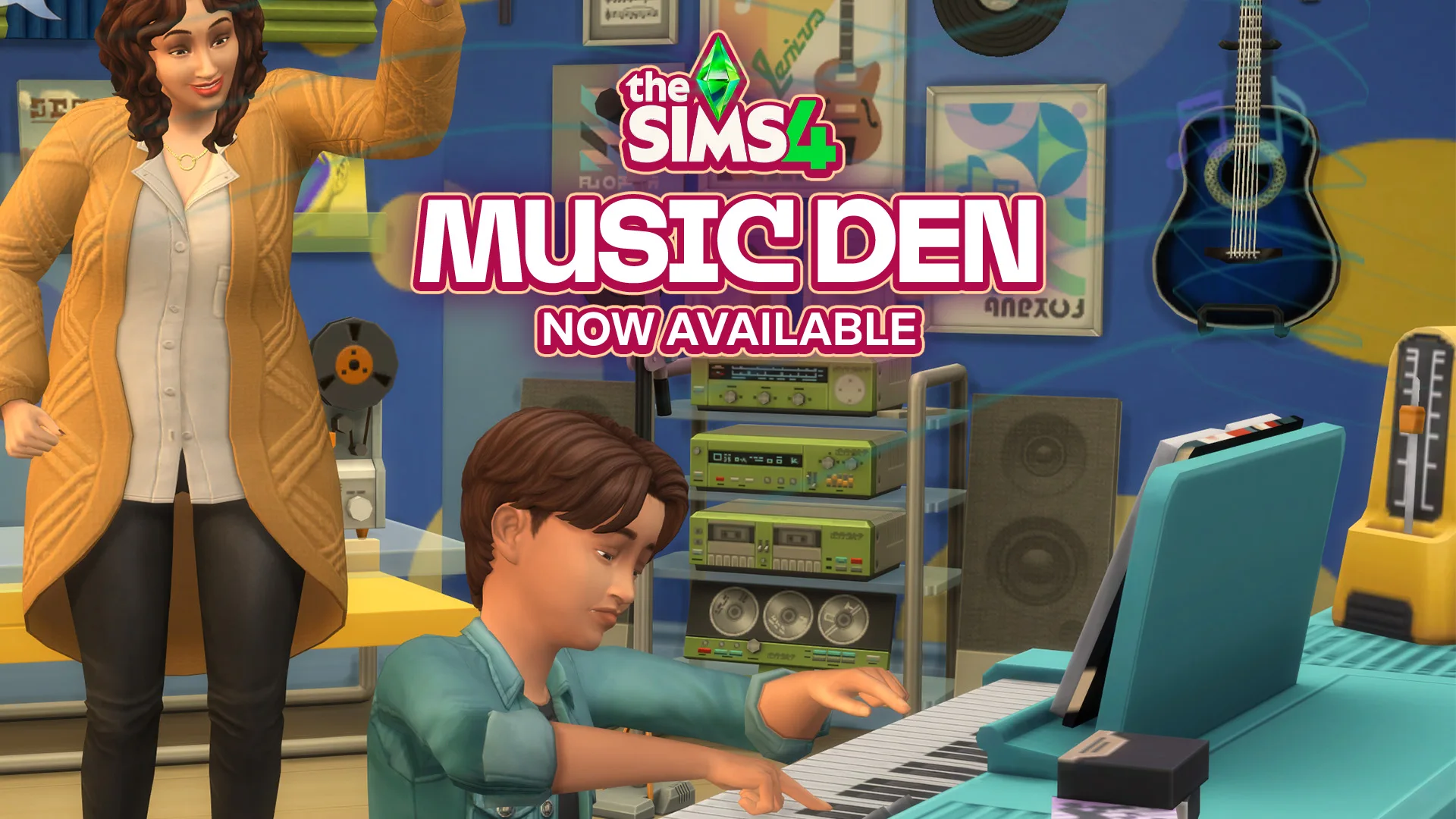
The official Sims 4 Kit from EA and Maxis is here with a 200 Moola bonus. The Sims Team has just released their latest official The Sims 4 Music Den Kit across Computers and Consoles. Retailing at $4.99USD, or a price equivalent to your local currency, you’ll get access to tens of new Build Mode…
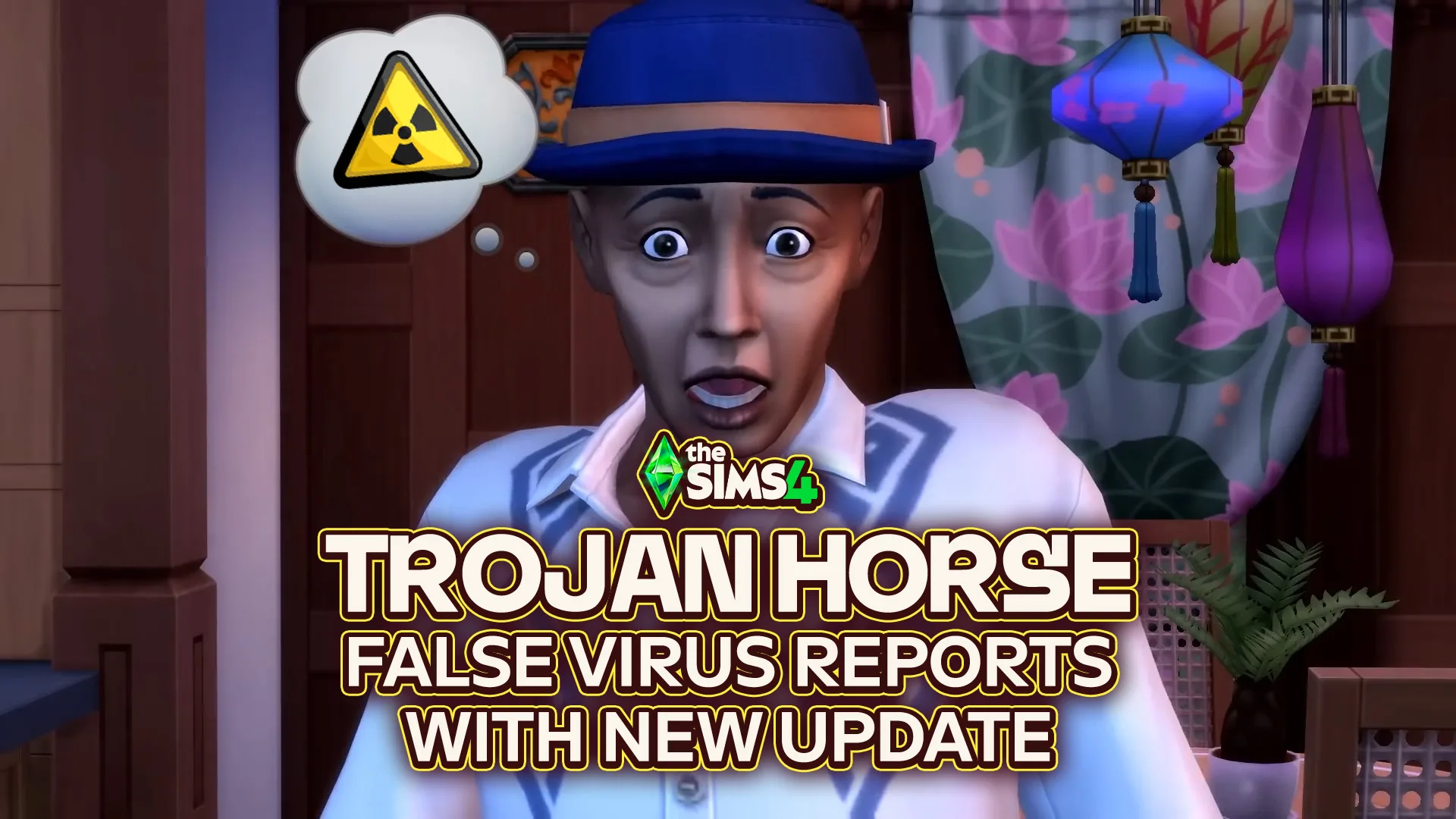
A hotfix for a Sims 4 Update fixing a false Trojan Horse Virus report! EA has just released a new The Sims 4 Update just for Windows PC users, addressing the new false Windows reports that the game contains a Trojan virus. This issue has now been addressed, and if you haven’t downloaded the update…
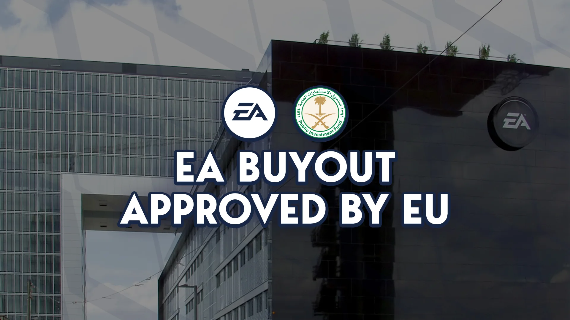
The $55 billion dollar buyout is now fully greenlit. Everyone’s been waiting for this moment, and last week’s Reuters report could’ve predicted it too. The European Commission has announced just an hour ago that they’ve fully approved the acquisition of Electronic arts, lead primarily by the Public Investment Fund (“PIF) of Saudi Arabia. The report…
As with most recent updates for The Sims 4, some new bugs or errors have popped up as the Sims Team applies fixes or changes to the ever-growing and aging game. From the roof bug that has just been fixed after showing up in the Sims 4 June Patch to mod conflicts and more, the…
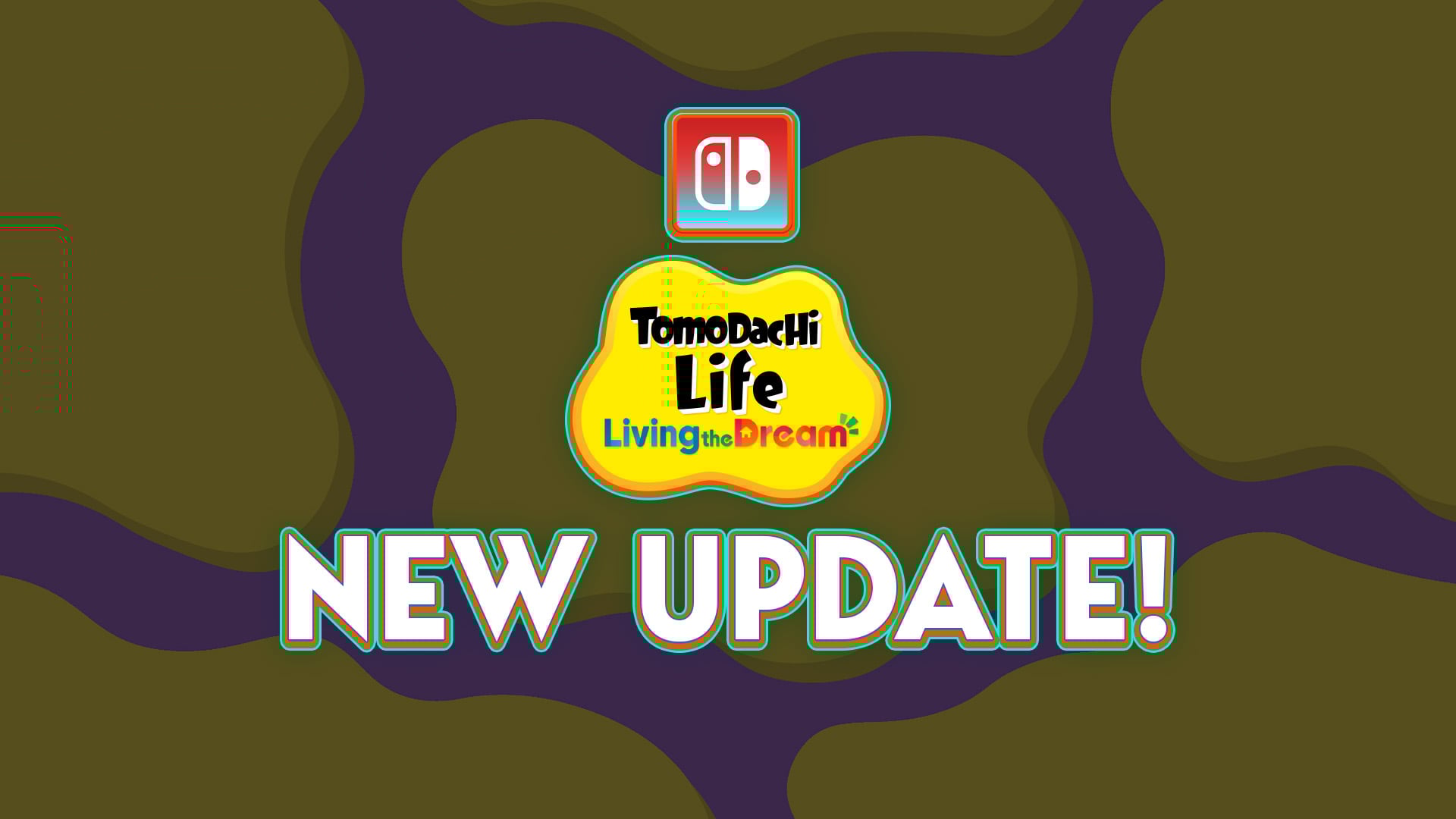
A new game patch has been released for Tomodachi Life! Nintendo has just released a brand new Tomodachi Life Update for Living The Dream across Nintendo Switch and Nintendo Switch 2 Consoles. Bringing the game version of Tomodachi Life: Living The Dream to v.1.0.4 and fixing several game issues. If you have automatic updates enabled…
6 Comments
i like the fact that we’re not flexing with our packs anymore
Reply to sargy
I kinda miss the pack renders, but I guess Snowy Escape said “Not doin it sorry”
Looks slick, like not seeing all the pack icons. It bothered me
Relived the Llamicorn’s gone. It kept glitching and moving way too fast which irritated my eyes.
As a graphic designer I see this change a step back. Every design element is a little off to the visual brand they developed so well in 2019. Like they got rid of the gradient then now they brought it back with a completely different color scheme. They used rounded square button instead of the fully round ones which are more common in the game. Not even mentioning the underlined subtitles on the top.. I’m not complaining, it’s just a start screen which doesn’t effect how great the game and its other updates are, it just feels like a step back for me both as a fan and a professional eye.
Reply to adamz
i think they’re trying to remind sims 3 because the main menu looks alot like sims 3 launcher i think
Welcome to Sims Community!
Our community is about connecting people through open and thoughtful conversations. We want our readers to share their views and exchange ideas in a safe space.
In order to do so, we've created a simple set of rules that will improve your experience. Simply put, keep it civil.
Your post will/might be rejected if it contains:
User accounts will/might be blocked if we notice:
So, how can you be a power user?
Thanks for reading our community guidelines. Please note that we're aware of certain issues with Sign In / Log In and Create Account / Email Confirmation issues. We're working behind-the-scenes on a new Account Creation process. Thank you for your patience and remember - freedom of speech is not freedom of reach